Developing a conceptual idea in Affinity photo for iPad
We are going to edit a photo from the ‘Botanical theatre’ series. I recently switched from Adobe to Serif company and their Affinity products. I found myself rarely using Photoshop and even Lightroom, so their subscription mode didn’t make sense anymore. This walk-through is created in Affinity photo for iPad but if you have a desktop version please give it a try. I think it shouldn’t differ so much.

flower in Vyšehrad by miresk
As I was reviewing the photos I got an idea to create something saturnine 😊 According to Merriam-Webster dictionary there are a few meanings. One of them is the following:
cold and steady in mood / of a gloomy or surly disposition.
Here is a result after a few edits that we are going to make together. By the way, did you know that Saturn’s rings are made mostly of chunks of ice? Brrr..I think that definition above could work for this image.

Result
1. Perspective
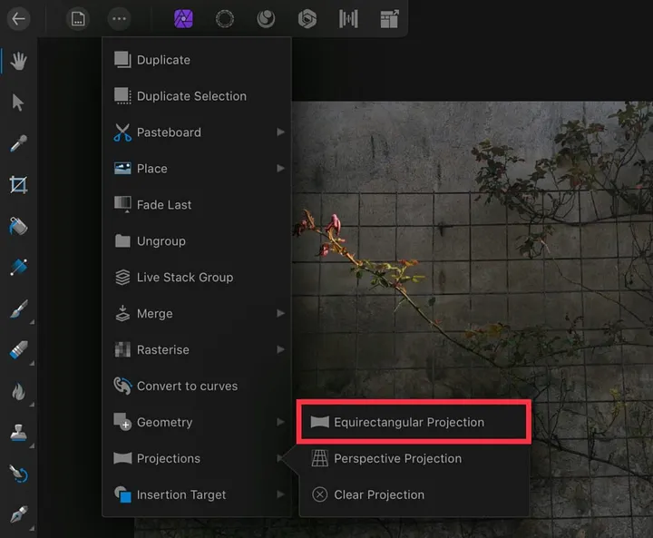
A photo we work with has a grid on the wall. As a first step let’s change the perspective of this photo to create a bending wall effect. Something that looks like if we were inside a well. Click the three dots to expand the menu and select Projections -> Equirectangular Projection.
Move around the photo until you are happy with a perspective. We want one flower to stand out in the final composition so keep that in mind.

2. Tracing with pen tool
Now after we applied the projection we can use the pen tool to select a few tiles on a wall. We will later use them as windows that we can look through.
Select Pen tool and click from one corner of a tile to another creating the lines until you close the first point.
TIP: Select Edit Mode (1st icon from left at the bottom of the screen) to quickly adjust the nodes and curves.
After you trace the lines Use fill (for example white) to see what you have already traced.

3. Download space images
There is a cool feature called Stock where you can browse images available to download and use them in your work. I wrote ‘saturn’ in the search bar and found a photo of space I liked. Then I switched to Pixabay service and downloaded an image of Saturn planet.

4. Rasterise the layers
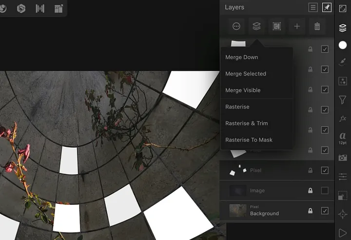
We can hide the downloaded images for now as we are going to rasterise the vector layers created with pen tool from step 2. Select a layer, click on the 2nd icon from left top in Layers panel and select Rasterise. Do this step for each vector layer (white squares).
If you know how to rasterise several selected layers at once let me know please 😊

5. Merge selected layers and mask
In this step we are going to select all pixel layers we rasterised. On iPad version of Affinity Photo you can do it by swiping a layer for example from left to right. When they are all selected, go to menu options as in previous step and click Merge Selected. We will get 1 layer from the objects we traced with the pen tool.
Grab this layer and drag it onto a thumbnail of the space photo as displayed below. This will effectively create a mask, and we can look through the windows to universe.

6. Clean up the scene with the erase brush tool
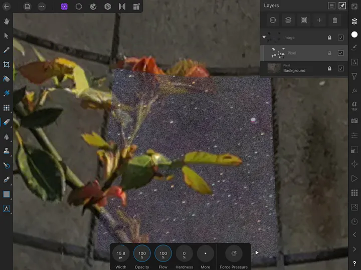
Bring the opacity of the universe background down and zoom in to parts where the flowers intervene. Erase these parts of the mask so the leaves can shine in the moonlight 😊

7. Making it more saturnine
We are almost done. It’s looking pretty good but Saturn is still missing so let’s make it visible and move it to top in the layers panel.
I placed it at the top so it’s nicely aligned with the grid, rotated it slightly and erased the black parts of the image so only the planet itself is visible. Then I applied the Darker Colour layer mode which made some segments of the image noisy.

8. Final tweaks in Develop mode
Select the background photo (wall) and go to Develop mode (lens icon at the top). There we can adjust many things like curves, brightness, colors etc. but I adjusted only Vignette effect to make the corners darker so the flower stands out a bit more in our final composition.

And that’s it. I would like to see your version so please feel free to share it and let me know if anything wasn’t clear.
Many thanks for reading and sharing this tutorial!